Guide
A calmer desktop
A calm desktop comes down to fewer things moving and fewer colors competing. macOS 27 has a setting for almost every part of it, and none needs Terminal. Work through these in order, starting with the wallpaper, because it sets the colors for everything else.
By Chris at Neon FrenchieUpdated Checked on macOS 27.0.1 on
1. Start with a quiet wallpaper
Pick something low in contrast with two or three colors, and keep it in mind as you go: the steps below are mostly about matching it. In System Settings, then Wallpaper, a solid swatch from Colors is the quietest choice. A dynamic wallpaper set to one of its still versions doesn’t change during the day. Turn on Show on all Spaces so every desktop matches. Our guide to wallpaper by time of day covers the dynamic options.
2. Clear the desktop
The quickest way to calm a desktop is to stop showing what’s on it. Your files stay where they are.
- Open System Settings, then Desktop & Dock.
- Under Desktop & Stage Manager, next to Show items, turn off On Desktop.
Click the wallpaper when you need the files again. Older guides use defaults write com.apple.finder CreateDesktop for this; you don’t need it.
If you’d rather keep files on the desktop, tidy them instead:
- Stacks. Control-click the desktop and choose Use Stacks. Files gather into piles by kind, and Group Stacks By sorts them by date or tags instead.
- Spacing. Control-click the desktop and choose Show View Options to make icons smaller, add grid spacing or move labels to the right.
- Drives. To hide disks and servers only, open Finder, then Settings, then General and turn them off under Show these items on the desktop.
3. Fewer widgets, in one color
One or two widgets are plenty. Control-click the wallpaper and choose Edit Widgets… to add them, then Control-click a widget to change its size or choose Remove Widget.
Then open System Settings, then Desktop & Dock and set Dim widgets on desktop to Always. Desktop widgets stay monochrome instead of full color, which keeps them from competing with the wallpaper.
4. Folders that match
Since macOS 26, folders can take a color. In System Settings, then Appearance, Folder color changes every folder in Finder at once. For a single folder, select it and choose Customize Folder… from the Control-click menu to give it a color, a symbol or an emoji.
You can also paste your own picture onto a folder in Get Info. If it doesn’t show up or update, see when Finder won’t update a folder icon.
5. A quieter Dock and menu bar
In System Settings, then Desktop & Dock, these settings take most of the motion out of the Dock:
| Setting | Calm choice |
|---|---|
| Automatically hide and show the Dock | On |
| Show suggested and recent apps in Dock | Off |
| Magnification | Off |
| Minimized window animation | Scale Effect |
| Animate opening applications | Off |
For the menu bar, hold Command and drag any icon you don’t need off the bar. In System Settings, then Menu Bar, turn apps off under Allow in the Menu Bar to hide their icons for good, without a separate app. Show menu bar background decides whether your wallpaper shows through the bar, and Automatically hide and show the menu bar can hide it on the desktop or in full screen.
6. Match the system colors
In System Settings, then Appearance:
- Appearance: choose Light or Dark to suit the wallpaper, or Auto to switch with the time of day.
- Liquid Glass: new in macOS 27, a slider from clear to fully tinted. Clear lets more of the wallpaper through.
- Color, under Theme: pick the one closest to your wallpaper. It colors buttons and selections.
- Icon & widget style: Default, Dark, Clear or Tinted. Clear and Tinted give icons and widgets one consistent look. Tinted uses the color under Theme.
- Tint window background with wallpaper color: on, windows pick up a trace of the wallpaper.
Vibe recipes with MacScapes
MacScapes adds the one thing the settings above can’t: a wallpaper that moves slowly, with widgets that take their colors from it. A vibe is a scene, a palette and a set of widgets saved together, and you can switch them by hand or on a schedule. These four come with the app and work without Pro.
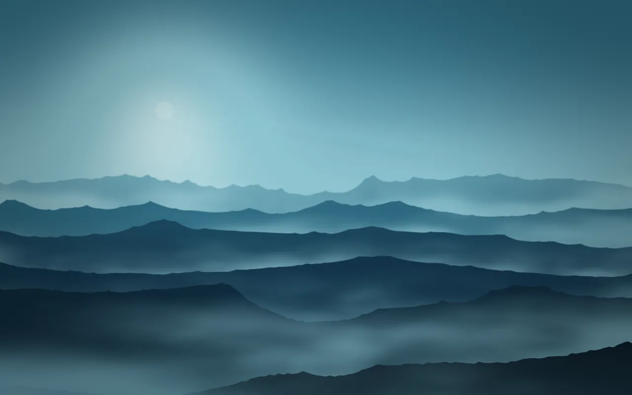
Quiet Morning
- Scene:
- Mist, in Glacier
- Widgets:
- A large serif clock
- Pair with:
- Dark appearance, Clear icon style

Golden Hour
- Scene:
- Silk, in Ember
- Widgets:
- The date, bottom left
- Pair with:
- Dark appearance, Tinted icons in a warm color

Daydream
- Scene:
- Haze, in Lilac Haze
- Widgets:
- The date and a small clock
- Pair with:
- Auto appearance, Tinted icons in a soft color

Koi Pond
- Scene:
- Koi, in Lagoon
- Widgets:
- A clock, bottom left
- Pair with:
- Dark appearance, Dark icon style
Folder icons in MacScapes use the same palettes, so your folders can match the scene too. See the widgets and folder icons pages for what each can do.